

JagWire staffers review art at the Nelson-Atkins Museum of Art
JagWire reporters share art pieces that may go overlooked at the Nelson-Atkins

ONCE UPON A TIME
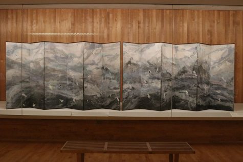
Japanese artist Ibe Kyoko created “Once Upon a Time” in 2017. Using recycled ganpi paper, ink and minerals, she created a pair of six-fold screens that displays a blend of Chinese and Japanese style watercolors. Kyoko uses fragments of old manuscripts to symbolize figures amidst the landscape.
We were enthralled by this piece by Ibe Kyoko. This six-fold screen is part of a series of pieces focusing on Japanese culture. The screens are made from “washi” or handmade paper that Kyoko made herself. Additionally, she created the colors using natural materials, like gemstones.
Additionally, Kyoko added Japanese characters to the piece in order to illustrate stories from Japanese history about paper-making. The title itself feels like part of a story, like the introduction to a series of work.
The panels were huge and sprawling in person, making it hard to get a full view of the piece in its entirety. However, this made it completely immersive, making the viewer feel surrounded. The grays and blues gave the piece a dark, ominous tone, like Kyoko was painting the ocean or a storm.
By standing in front of the piece, the viewer almost feels like a part of the work. Viewing this creation is just another way to surround yourself with darkness, although it is much cheaper to just come to school instead.
STAMMER MILL WITH STREAKED SKY
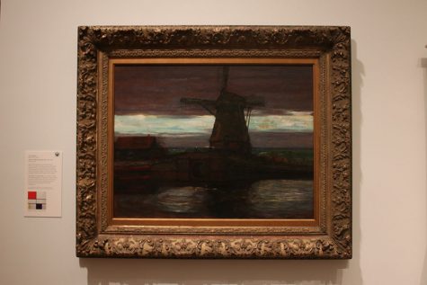
Dutch painter, Piet Mondrian painted “Stammer Mill with Streaked Sky” from 1905-1907. The use of primary colors and geometric leads to his famous composition grids.
Contrary to popular belief, this is actually a painting and not a photograph using portrait mode. In contrast to some of the paintings we viewed at the Nelson, this painting appears to have actually required both effort and artistic talent.
Piet Mondrian is best known for his abstract pieces with thick black lines and red, blue and yellow squares. Because of that later work, we thought this piece was really interesting. You can see how the paintings he’s most famous for came from the Stammer Mill. This painting uses thick lines, geometric shapes and lots of red, green and blue tones. Mondrian’s interest in bold color and strong lines is made obvious with this piece.
CAST ALIVE
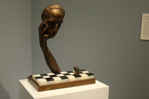
“Cast Alive,” painted in 1967 by Marcel Duchamp, was inspired by Duchamp’s status as a chess master and his interest in mathematics.
Although Marcel DuChamp is often recognized for his art, DuChamp was also a chessmaster who deeply believed in the beauty of the game, to the point where he published a treatise on the merits of chess in 1932. DuChamp believed that chess was more like poetry than art is, which is how I feel about apples to apples, but the Nelson isn’t interested in any of my fan art.
There is a clear parallel between DuChamp’s piece and “The Thinker,” with both of the subjects having their head in their hands. The head and forearm are the only parts of the artist represented as DuChamp ponders the last piece left: the knight.
Like DuChamp’s image of himself, the piece left us with many unanswered questions, such as, what is the subject thinking about? He’s playing on half a board with only one chess piece. I’m no expert, but I’m pretty sure this limits the amount of moves he is capable of making.
Other than the casting of the arm, the piece itself was very cool. By using bronze for DuChamp’s self-sculpture, the body is contrasted with the clear onyx black and white of the chess board, drawing the eye and offering visual appeal. The composition, with the placement of DuChamp’s figure and the chessboard, also makes one think about the implications of the game he plays. Remember kids, we are all just knights in the game of life.
LADY SEATED BEFORE A BLACK BACKGROUND
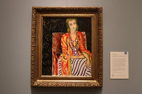
French painter, Henri Matisse painted “Woman Seated Before a Black Background” in 1942. He used a lot of vivid brushstrokes and bright colors to show hope during World War II.
Henri-Émile-Benoît Matisse created this piece in the middle of WWII, but you probably wouldn’t be able to guess from just looking at the painting. She’s of completely bright, almost neon, colors that strongly contrast with the black background. It’s easy to view the brighter colors as a reference to happiness and good things in the world persisting despite the crushing darkness surrounding it. In addition, the woman’s expression is calm and uplifting, demonstrating optimism in the face of a terrible reality. Of course, that’s the English teacher interpretation. It really could be just a lady seated before a black background.
Matisse also used a variety of brush strokes to create the piece. The black background is scored with thin curlicues, breaking up the darkness. We can all relate to the feeling of being crushed by overwhelming outside force, also known as the current political climate.
This painting, and many of Matisse’s others, were heavily influenced by his work as a technical artist, sculptor and printer. He also made art in response to social and political current events. Matisse was considered rebellious in his time, but his work helped define modern day art.
STUDY OF A PEASANT’S HEAD
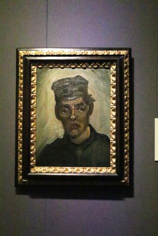
Dutch painter, Vincent van Gogh painted “Study of a Peasant’s Head” in 1885. He painted the piece using soft earth tones to depict the peasant.
Over the course of four years, Vincent van Gogh created a series of character studies about poor, working class people. “Study of a Peasant’s Head” is one of those works, focusing on a peasant who digs potatoes. Vincent van Gogh is a master of making art that is not realistic, a talent he demonstrates in Study of a Peasant’s Head. It’s easy for the viewer to recognize the subject of the painting as a peasant, because he doesn’t have airpods in.
This piece of art was van Gogh’s attempt to compare the peasant to his work of harvesting potatoes. The soft, earthy tones, lighting and shapes used drive this in. The greens and browns make the peasant appear not dissimilar to the potatoes he digs.
The emphasis placed on the peasant’s eyes draws the viewer in, making one wonder about the story behind the painting. The expression on his face is ambiguous, wide-eyed and focused on something or someone in the distance, as he looks to the viewer’s right.


This is sophomore Jonathan Atchley’s first year on the JagWire staff. He is a photographer. When he is not taking photos, he is running the streets of Shawnee with the Mill Valley Cross Country and Track team. He is also serving as a class representative on StuCo for his second term.

This is senior Elizabeth Joseph’s second year on the JagWire staff. She is undertaking the position of Mill Valley News editor-in-chief alongside Katya Gillig and Marah Shulda. When she's not in the J-Room, she can be found in A207 serving as the Science Olympiad team captain or the president of National English Honor Society. She is also a part of National Honor Society and MV Outreach. Additionally, Elizabeth enjoys admiring plants, bopping to...

This is senior Ben Wieland’s third year on staff and his second year as Mill Valley News editor-in-chief. When he isn’t running the website, you can find Ben at StuCo, Youth for Refugees, Young Democrats or Quiz Bowl meetings — and if he isn’t there, he’s probably at home watching TV.

This is senior Andrew Tow’s third year on staff. He is proud to say that he upholds the position of photo editor for the second year in a row. Outside of the J-Room, Andrew is involved in band. Whenever he gets time away from school, he is either serving at his church or working.

This year is senior Hannah Chern’s third year as part of the JagWire newspaper staff and second year as one of the editors-in-chief. In addition to leading and working on the JagWire, Hannah serves as an NHS officer and participates in Science Olympiad where she expresses her love for science. Outside of school, Hannah finds herself spending her free time endeavoring the world of crochet, watching YouTube tutorial videos, reading books and discovering...